

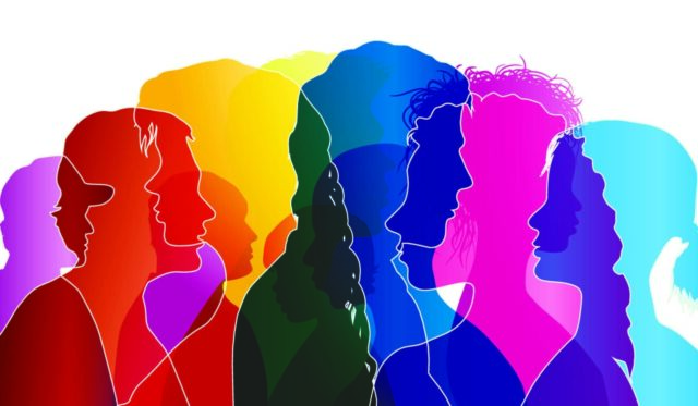
Color, a powerful yet often overlooked design tool, possesses a profound ability to influence human emotions, perceptions, and behaviors. Rooted in the intriguing world of color psychology, the hues we encounter in our built environment can impact our mood, stimulate our senses, and even drive our decisions.
As commercial architecture strives to create spaces that are not just aesthetically appealing but also functionally effective, the understanding and application of color psychology have become increasingly important. This connection forms the core of our exploration in this article.
The psychology of color in commercial architecture bridges the gap between science, art, and business. By comprehending how different colors can stir diverse emotional responses, cognitive functions, and consumer behaviors, architects, designers, and business owners can create commercial spaces that resonate with their target audience, promote their brand identity, and drive their business objectives.
From retail outlets to office buildings, from restaurants to healthcare facilities, color’s influence is pervasive and potent. This article provides a deep look into this vibrant intersection of psychology and architecture.
What is Color Psychology?
Color psychology, a fascinating branch of psychology, centers on the study of how colors influence human behavior and emotions. Rooted in both the biological responses and cultural associations we have with colors, this field of study seeks to comprehend the subtle ways in which hues can influence our thoughts, moods, and actions.
Although the exact origins of color psychology are difficult to pinpoint, the power of color has been acknowledged and utilized for centuries, with ancient civilizations using color in healing practices, religious rituals, and architectural designs.
The study of color psychology involves several theories and principles that explore our emotional, psychological, and physiological responses to color. It’s believed that our brains perceive colors as a type of visual information, which is then processed and interpreted, leading to certain responses.
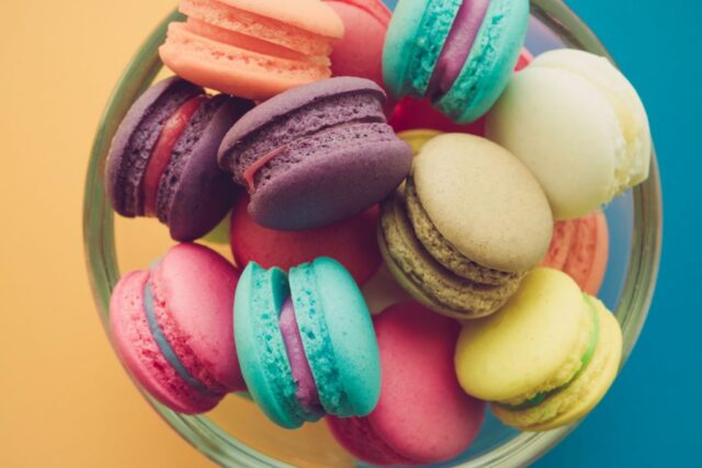
For instance, warm colors such as red, orange, and yellow are often associated with feelings of warmth, comfort, and excitement, while cool colors like blue, green, and purple might elicit feelings of calm, relaxation, and peace.
Color psychology is important to keep in mind when constructing your business because it sets the tone for your clients and influences how people perceive your business.
In a commercial architecture firm for example, muted cool shades are ideal, as they lend the building a practical, calm feel. This broad categorization, however, is just the tip of the iceberg as individual colors can stir a vast range of responses, often nuanced by personal experiences and cultural associations.
Impact of Color on Human Perception and Behavior
Psychological Responses to Different Colors
Color can profoundly impact how we perceive our surroundings and influence our emotional responses. Warm colors like red, orange, and yellow are often associated with energy, passion, warmth, and excitement.
On the other hand, cool colors like blue, green, and purple elicit feelings of calm, relaxation, and peace. Red, in particular, has been found to raise heart rates and increase feelings of intensity, while blue is often linked with a sense of tranquility, reliability, and trustworthiness.
Cultural and Emotional Responses to Color
In Western cultures, green often signifies nature, growth, and renewal, whereas in some Eastern cultures, it may symbolize fertility and prosperity. Similarly, white may symbolize purity and peace in some Western cultures, though it often signifies mourning in many Eastern cultures.
Thus, colors can evoke a wide array of emotions, with the same color potentially triggering different emotional responses in different individuals or cultures.
Color’s Influence on Cognitive Functions and Behaviors
Research suggests that blue might stimulate creativity, while red can improve attention to detail. In the context of commercial spaces, color can affect customers’ purchase decisions, employees’ productivity levels, and overall user experiences.
Studies have found that certain hues can stimulate appetite, making them popular choices for restaurants, while others can create an impression of reliability and professionalism, making them suitable for corporate environments.
Color Psychology in Commercial Architecture
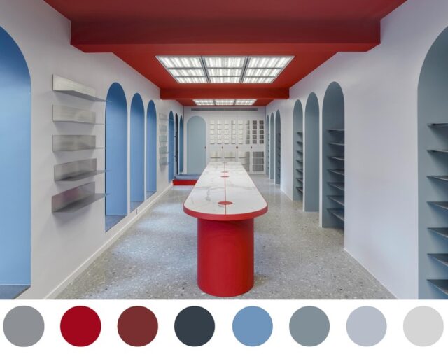
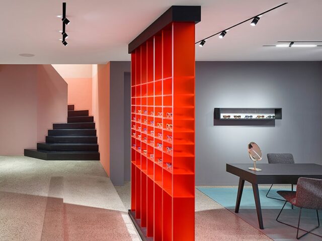
The chosen color scheme should align with the brand identity, reinforce the business’s values, and appeal to the desired demographic. For instance, a technology company targeting a young, innovative audience may opt for bold, vibrant colors to communicate creativity and forward-thinking.
In contrast, a legal building will likely sport more muted, calm colors to support the professional atmosphere.
Retail Spaces
In retail environments, color can significantly influence customer behaviors and purchase decisions. Warm colors such as red and yellow can encourage impulse buying, while cooler colors like blue and green can create a relaxed atmosphere that encourages customers to stay longer.
Office Buildings
For office buildings, colors that boost productivity and reduce stress are often favored. Soft blues and greens are known to instill a sense of calm and focus, while small accents of vibrant colors like yellow can stimulate creativity and positivity.
Restaurants and Hospitality Establishments
In restaurants and hospitality establishments, color choices can impact appetite, perceived wait times, and overall customer satisfaction. Warm, appetizing colors such as reds, oranges, and yellows are often used in dining areas, while cooler colors are employed in lounge or waiting areas to promote relaxation.

Healthcare Facilities
In healthcare facilities, color selection is crucial to promote healing and reduce stress. Soft blues, greens, and neutrals are often used for their calming effects, while brighter, cheerful colors might be utilized in children’s areas to create a more uplifting environment.
The psychology of color in commercial architecture is a potent tool that, when wielded with understanding and finesse, can greatly influence human behavior, emotions, and perceptions. As the interplay of science, art, and business continues to evolve, it’s evident that the thoughtful application of color will remain a critical aspect of design strategy.
Ultimately, the mindful and strategic use of color in our built environment can lead not just to more beautiful spaces, but also to more meaningful, productive, and satisfying interactions within those spaces.


