
In the busy world of 2024, store signs are more than just arrows pointing the way; they pulse with the life of your business’s spirit and the way you chat with your customers. Making your sign pop in a sea of ads and messages is super important. Let’s jump into nine key tips to help you whip up signs that not only catch the eye but also share your business’s story in a snap.
1. Getting to Know Your Aim
First off, you need to be crystal clear about what you want your company signage to do. Is it about pulling in new folks, showing them where to go, spotlighting your goods, or making your business a name everyone knows? Pinning down this goal is like marking a spot on your map; it guides the way you shape your sign, ensuring it’s not just pretty but also doing its job for you.

2. Staying True to Who You Are
Your sign should fit into your brand like a perfect puzzle piece, matching the colors, fonts, and logos you already rock. This harmony creates a trusty feel with your crowd. When people glance at your sign, they should instantly get that it’s you talking to them, no doubts about it.
3. Keeping Things Clear and Simple
A sign’s mission is to get a message across, and quick. Overly fancy designs or tough-to-read fonts can blur your message. Choose fonts and colors that make your sign a breeze to read from a distance and under any light. The golden rule here is simplicity—your sign should make its point in just a quick look.
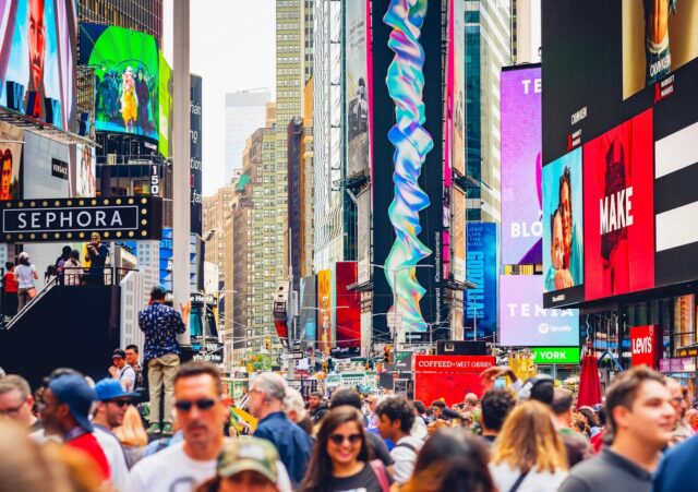
4. Picking the Perfect Spot
Where you plant your sign is a biggie. It influences everything from its size to its design. Whether it’s up close or way off in the distance, on a busy street or a quiet nook, you need to think about its home when designing. Signs that folks will see up close can afford more detail, while those seen from far off need to be bold and simple.
5. Choosing Colors Smartly
Colors pack a punch; they can trigger emotions and memories. Picking the right hues for your sign can really shape how folks feel about it. For instance, blue might make your brand seem reliable, while yellow can catch the eye and spark happiness. But always balance attention-grabbing colors with making sure your sign is pleasant to look at and fits your overall vibe.
6. Quality Talks
The quality of your sign speaks volumes about your brand. Top-shelf materials and finishes not only help your sign last longer but also show you’re serious about your biz. Choosing the right materials for your sign’s environment (indoors, outdoors, busy places) keeps your sign looking top-notch for ages.
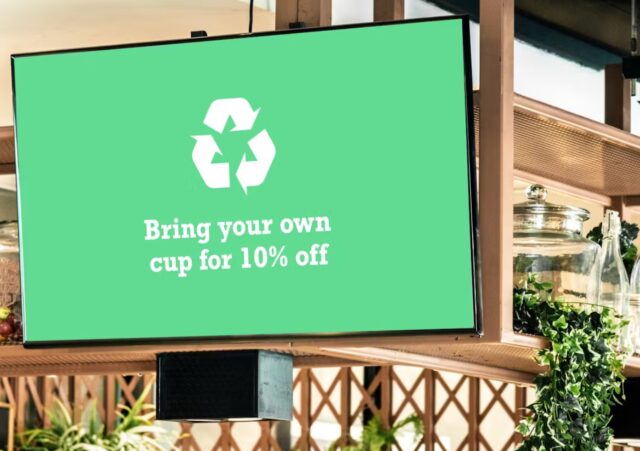
7. Embracing the Tech Wave
In 2024, mixing tech with signs is just what’s done. Digital signs can switch up their message, display moving images, update on the fly, and even interact with folks. This can make your sign more dynamic and flexible. Just be sure it’s easy for everyone to use so they can get the full experience.
8. Thinking Green
Being eco-friendly is not just kind to the planet; it’s something customers dig. Designing your sign with the planet in mind, using sustainable materials and energy-efficient lights, not only reduces your eco footprint but also casts your brand in a good light.
9. The Power of Empty Space
Don’t underestimate the impact of empty space in your design. This space helps structure your sign, making it easier for folks to spot the key bits. A design that uses empty space well looks cleaner, more polished, and is quicker to grasp. This ensures your main message shines without getting swallowed by a cluttered background.
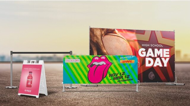
10. Getting Creative with Shapes and Materials
Stepping away from the standard square signs and usual materials can really make your brand stand out. Experiment with shapes and materials that reflect your brand’s essence. Whether it’s wood for a homey feel, metal for a sleek look, or transparent elements for a futuristic touch, these choices help shape how people see your brand.

11. Keeping Content Fresh
These days, content is king, and your sign should reflect that. Content that changes, like showcasing current specials, upcoming events, or adjusting to the time of day, keeps your sign relevant and engaging. Adding personal touches, like local shout-outs or interactive features that respond to viewers, turns your sign into more than just a sign—it becomes a part of their day.
12. Valuing Feedback
Never overlook the power of good feedback. Hearing from your team, your customers, and design experts can highlight what’s hitting the mark and what’s missing it. This team approach can iron out any wrinkles before your sign goes live and ensure it really clicks with the people you want to reach.
13. Focusing on Accessibility
Making sure your sign is easy for everyone to get is key in today’s inclusive world. Accessibility means designing your signage so it’s simple to understand and enjoy for folks with various needs, including those with visual impairments, cognitive disabilities, or mobility issues.
This might mean using high-contrast colors for better visibility, adding Braille or tactile elements for the visually impaired, and making sure the sign’s placement is accessible for everyone, including those using wheelchairs.
Remember, an accessible sign not only meets legal standards in many areas but also shows your brand’s commitment to welcoming and respecting all community members.
Bringing It All Together
To sum it up, crafting a sign that does its job in 2024 is all about blending simplicity, creativity, and clever planning. You’ve got to really understand your brand, know your audience, and keep up with design and tech trends. Armed with these nine tips, you’re ready to make signs that do more than just catch the eye—they share your brand’s story in a way that sticks.


